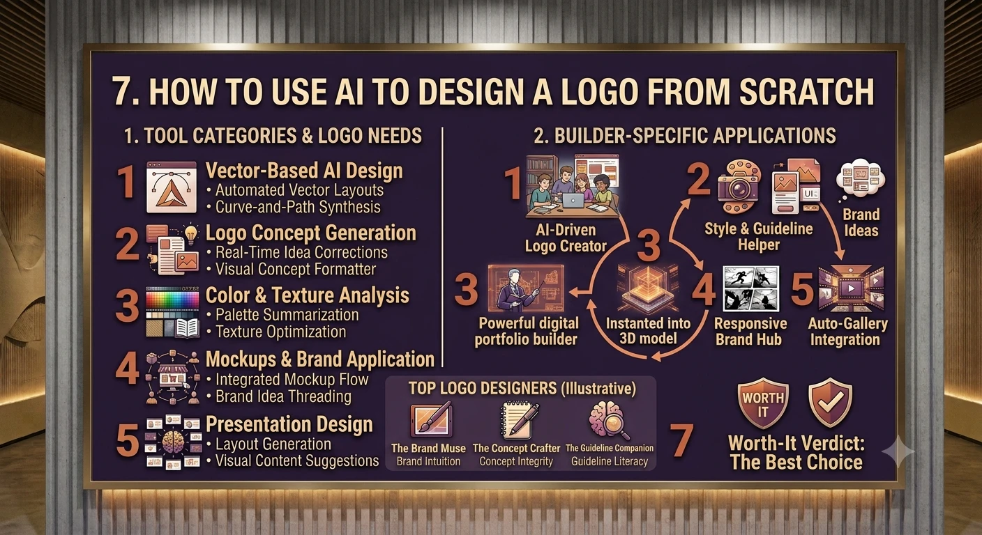
A step-by-step approach to generating and refining a usable logo with AI, even with zero design skills.
1. Introduction: What AI Can and Can't Do for a Logo
Not long ago, designing a logo meant either paying an agency several thousand dollars or spending weeks learning vector software just to produce something usable. That barrier has mostly collapsed. In 2026, AI-powered tools can generate professional-looking logo concepts, brand color palettes, and supporting identity elements in minutes rather than weeks, which has genuinely changed who gets to have a real visual identity — solo founders, side projects, and small businesses that would never have hired a designer.
What AI is good at is exploration: producing a wide range of visual directions quickly, so you can figure out what resonates before committing to one. What it is not yet reliably good at is finishing a logo to true professional production quality on its own — AI models tend to over-add detail, gradients, and shading that a real logo mark should not have, and they often produce raster images rather than the clean vector files a logo actually needs to survive being resized from a favicon to a billboard. The honest way to think about AI in this process is as a fast, tireless collaborator for the early stages — not a replacement for the judgment that turns a nice image into a working brand mark.
This guide walks through the full process end to end: defining the brand before opening any tool, picking the right AI tool for your situation, writing prompts that actually produce usable output, shortlisting and refining what the AI gives you, and testing the result the way a real logo needs to be tested. It closes with the mistakes that most commonly give an AI logo away, and a candid answer to the question of when it's worth hiring a human designer instead.
2. Step 1 — Define the Brand Before Opening Any Tool
The single biggest mistake beginners make is opening an AI generator before deciding anything about the brand itself. Every professional workflow — AI-assisted or not — starts with the same questions: what does the company actually sell, who does it serve, what makes it different from competitors, and what personality should the mark project? Skipping this step doesn't save time; it just means more wasted generations later, because the AI has nothing specific to work from.
Before generating anything, write down:
- Three words that describe the brand's personality (e.g. "trustworthy, modern, understated").
- The industry and the target audience, in one sentence each.
- A rough style direction — minimalist, geometric, mascot, hand-drawn, vintage, or abstract.
- A starting color preference, even a loose one ("warm and earthy" is enough to start).
- Any competitor logos you want to look distinct from, so the AI doesn't converge on the same clichés.
This groundwork takes fifteen minutes and will save far more than that in wasted prompt attempts. It also gives you a way to judge the AI's output objectively — instead of picking whatever looks prettiest, you can ask whether each option actually matches the three personality words you wrote down.
3. Step 2 — Choose the Right AI Tool for the Job
Not all AI logo tools work the same way, and picking the wrong category for your situation is the second most common source of frustration. Broadly, the tools fall into three groups.
Template-based generators (Looka, LogoAI, Design.com) These tools take your business name, a few style preferences, and an icon choice, and recombine them using curated symbol and font libraries into a grid of options. They are fast, cheap, and reliable, but the tradeoff is originality: the system is recombining existing assets rather than inventing new shapes from nothing, so the results can look templated. This lane is right for anyone who needs something usable today and isn't chasing a highly distinctive mark.
Conversational image generators (Midjourney, GPT Image, Nano Banana) These are general-purpose AI image generators, not logo-specific tools, but with the right prompting they can produce far more distinctive and artistically sophisticated concepts than a template generator. The tradeoff is that they usually output a flat raster image rather than a usable vector file, and they need more iteration and prompt skill to avoid over-detailed, gradient-heavy results that don't work as a real logo mark. This lane suits anyone who wants something distinctive and doesn't mind a conversational, iterative process.
Logo-specific vector generators (Logo Diffusion, Recraft) A newer category is trained specifically on curated logo design datasets rather than general internet images, with models built to follow logo design principles and avoid the small errors that break a mark — asymmetry, muddy details at small sizes, or shapes that don't reduce cleanly. Rather than tracing a raster image into vector shapes after the fact, these tools construct true vector output directly, which matters enormously for anything meant for print, signage, or packaging.
Which lane fits your situation
| Your situation | Best lane |
|---|---|
| Need a logo today, won't revisit it | Template generator (Looka, Design.com) |
| Want something distinctive, not a designer | Conversational generator (GPT Image, Midjourney) |
| Need real vector files for print or packaging | Logo-specific vector generator (Logo Diffusion, Recraft) |
| Building a long-term brand with real stakes | AI for exploration, then a human designer to finish |
4. Step 3 — Write Prompts That Actually Work
The gap between a mediocre AI logo and a genuinely usable one is almost always the prompt, not the tool. A vague prompt like "coffee shop logo" gives the model nothing to work with beyond the most generic association it has for that phrase. A specific prompt gives it real constraints to design within — and constraints are what make a result look intentional rather than random.
What a strong prompt includes
- Style: minimalist, geometric, mascot, hand-drawn, vintage, abstract — pick one, don't blend several.
- Subject and concept: the specific shape or symbol, not just the industry ("geometric bean shape" beats "coffee").
- Color palette: name the actual colors, not just a mood ("navy blue and cream" beats "professional colors").
- Format constraints: explicitly ask for "flat design, vector style, white background" to steer away from photorealistic shading.
- Brand personality words: the three words from Step 1, worked directly into the prompt language.
A worked example: instead of "coffee shop logo," try "Minimalist vector logo for a high-end coffee roastery, geometric bean shape, navy blue and cream colors, flat design, white background." The difference in output
quality between these two prompts is not subtle — the second gives the model an actual design brief instead of a topic.
Iterate in rounds, not one shot
Treat the first batch of results as a mood board, not a final answer. Generate a wide first pass — twenty to thirty variations is a reasonable target — specifically to figure out what you hate and what you respond to, then narrow the prompt based on that reaction rather than trying to nail it in one attempt. Most tools let you adjust a "stylization" or creativity setting; lower settings keep results closer to literal instructions, higher settings introduce more unexpected variation worth exploring once you have a direction you like.
5. Step 4 — Generate, Compare, and Shortlist
Once you're generating results you don't hate, resist the urge to pick a winner immediately. A disciplined shortlist process produces a noticeably better final result than instinct alone.
1 Generate broadly first. Run enough variations across two or three prompt directions to see the range the tool is capable of before narrowing. 2 Sort into three piles: clearly no, maybe, and strong contender. Don't linger on the "no" pile. 3 Score the "maybe" and "strong" piles against your Step 1 brand words. A logo that looks great but doesn't match the brand personality you defined is a trap — it will look wrong once it's actually in use. 4 Narrow to three to five finalists and generate tighter variations of just those directions, adjusting color and detail level rather than starting over. 5 Get outside eyes on the finalists. Show them to someone with no context and ask what business they'd guess this represents — if the guess is wrong, the mark isn't communicating.
This is also the point to decide whether you're aiming for a fully AI-finished result or an AI-assisted starting point that a human will finish. Both are legitimate outcomes — but deciding now, rather than after you've fallen in love with a specific image, keeps the rest of the process focused.
6. Step 5 — Vectorize, Refine, and Fix AI Mistakes
Most AI image generators output a flat raster file (a PNG or JPG), which is not a usable final logo format. A real logo needs to scale from a 32-pixel favicon to a building sign without degrading, and only a true vector file (SVG or EPS) does that reliably. If your tool doesn't produce native vector output, this step can't be skipped.
Getting to a real vector file
- Tools built specifically for logo generation (Logo Diffusion, Recraft) construct true vector shapes directly — no separate tracing step needed.
- For raster output from general image generators, run it through a vector-tracing step (built into many logo maker platforms, or a dedicated vectorizer) before treating it as final.
- After tracing, inspect the paths — auto-tracing often adds unnecessary anchor points or jagged edges that a quick manual cleanup in vector software fixes fast.
Fixing the AI's common mistakes
AI image models tend to over-decorate. Left alone, they'll add shadows, gradients, and textures all at once — fine for a piece of art, wrong for a logo mark that needs to work as a single flat color at a small size. Before calling a design finished, actively simplify:
- Strip out drop shadows, bevels, and gradients unless there's a deliberate reason to keep them.
- Reduce the color count — most strong logos work in one to three colors, not five.
- Check that the mark still reads clearly when reduced to a single flat color (a real test of whether the shape itself is doing the work).
- Clean up typography by hand if a wordmark is involved — AI-rendered text inside logos is notoriously unreliable and often needs to be reset in real type rather than trusted from the generation.
7. Step 6 — Test the Logo in the Real World
A logo that looks great as a large, centered presentation image can still fail in actual use. Before finalizing anything, test the mark the way it will actually be seen.
- Small-size test: shrink it to a 32x32 favicon size. If it turns into a smudge, the design has too much detail.
- Large-size test: blow it up to a size appropriate for a banner or sign. Vector files should stay crisp; raster files will visibly degrade.
- Single-color test: view it in pure black and pure white. A strong mark still reads clearly with no color at all.
- Context test: drop it onto a real social profile layout, a mocked-up product package, or a website header rather than judging it in isolation.
- Platform-specific sizing: for social-first brands, confirm the mark works cropped to a circular 400x400 profile photo, which cuts off the corners of a square composition.
If the logo fails any of these tests, that's a design problem to solve now — not a compromise to accept because a particular generation looked good on-screen at full size.
8. Common Mistakes That Make AI Logos Look Cheap
- Stopping at the first generation instead of iterating through a real shortlist process.
- Leaving in AI-typical over-detailing — gradients, shadows, and texture that a flat mark doesn't need.
- Shipping a raster file where a vector file was actually needed, causing blurry results the moment the logo is resized.
- Trusting AI-rendered text inside the logo instead of resetting the wordmark in real, legible type.
- Picking whatever "looks cool" instead of checking it against the brand's actual personality and audience.
- Skipping the small-size and single-color tests, then discovering the logo doesn't work once it's live.
9. Tool Comparison at a Glance
A quick reference across the tools most commonly used in each lane of the process described above.
| Tool | Category | Strength | Watch-out |
|---|---|---|---|
| Looka | Template-based | Fast, guided, name + style + icon workflow | Recombines existing symbols; less original |
| LogoAI | Template-based | Simple brand-name-first flow, easy customization | Similar templated feel to other generators |
| Design.com | Template-based | Quick, professional-looking output | Limited depth of customization |
| Midjourney | Conversational image gen | Most artistically sophisticated concepts | Raster output; needs vectorizing afterward |
| GPT Image / Nano Banana | Conversational image gen | Forgiving, iterative, low-cost entry | Same raster/detail issues as other image generators |
| Logo Diffusion | Logo-specific vector gen | True vector output, trained on curated logo data | Narrower scope than general image generators |
| Recraft | Logo-specific vector gen | Vector-first workflow, fast iteration | Best suited to simpler, cleaner mark styles |
Pricing and exact feature sets shift often enough that this guide intentionally omits specific dollar figures — check each tool's current pricing page before committing, and note that most offer a free preview with paid plans required to unlock full-resolution or vector export.
10. Final Verdict: When to Stop and Hire a Designer
AI has earned a legitimate place in the logo design process, but it's worth being honest about where that place ends. For a side project, an early-stage MVP, a social-media-first creator brand, or a business testing whether an idea has legs at all, an AI-generated and properly refined logo is not a compromise — it's a reasonable, cost-effective answer that can carry a brand through its first real stretch of existence.
The calculation changes once a brand has validated its direction and the identity needs to carry real, long-term weight — packaging, signage, investor materials, or a company that expects to be around in five years. At that point, a logo built by a human designer from a strategic brief tends to hold up better than an AI-generated image polished after the fact, because a professional designer is making deliberate tradeoffs at every step rather than selecting the least-bad option from a batch of generations.
A workable rule of thumb: use AI for what it's genuinely good at — fast, cheap, wide-ranging exploration — and treat professional design as the next investment once the brand direction is proven and the stakes of getting it wrong have gone up. Used that way, AI doesn't replace good design judgment. It just means far fewer people have to start that judgment from a completely blank page.
This guide reflects publicly available information on AI logo design tools and practices as of September 2026. Specific tools, pricing, and feature sets change frequently — confirm current details directly with each vendor before making a decision.